
postcard pantry
Creating an online and complementary in-person experience worthy of the beautifully delicious stories and products being shared and sold by Postcard Pantry, a gorgeous online shop specializing in carefully hand-curated tasting and gift boxes featuring local, artisan, American-made goods.

case studies / postcard pantry

All styled photos shot by Blueprint Society.
services
Website Design
Collateral Design
Wordpress Development
Copywriting + Content Strategy
Brand + Product Photography
Collateral Design
Wordpress Development
Copywriting + Content Strategy
Brand + Product Photography
deliverables
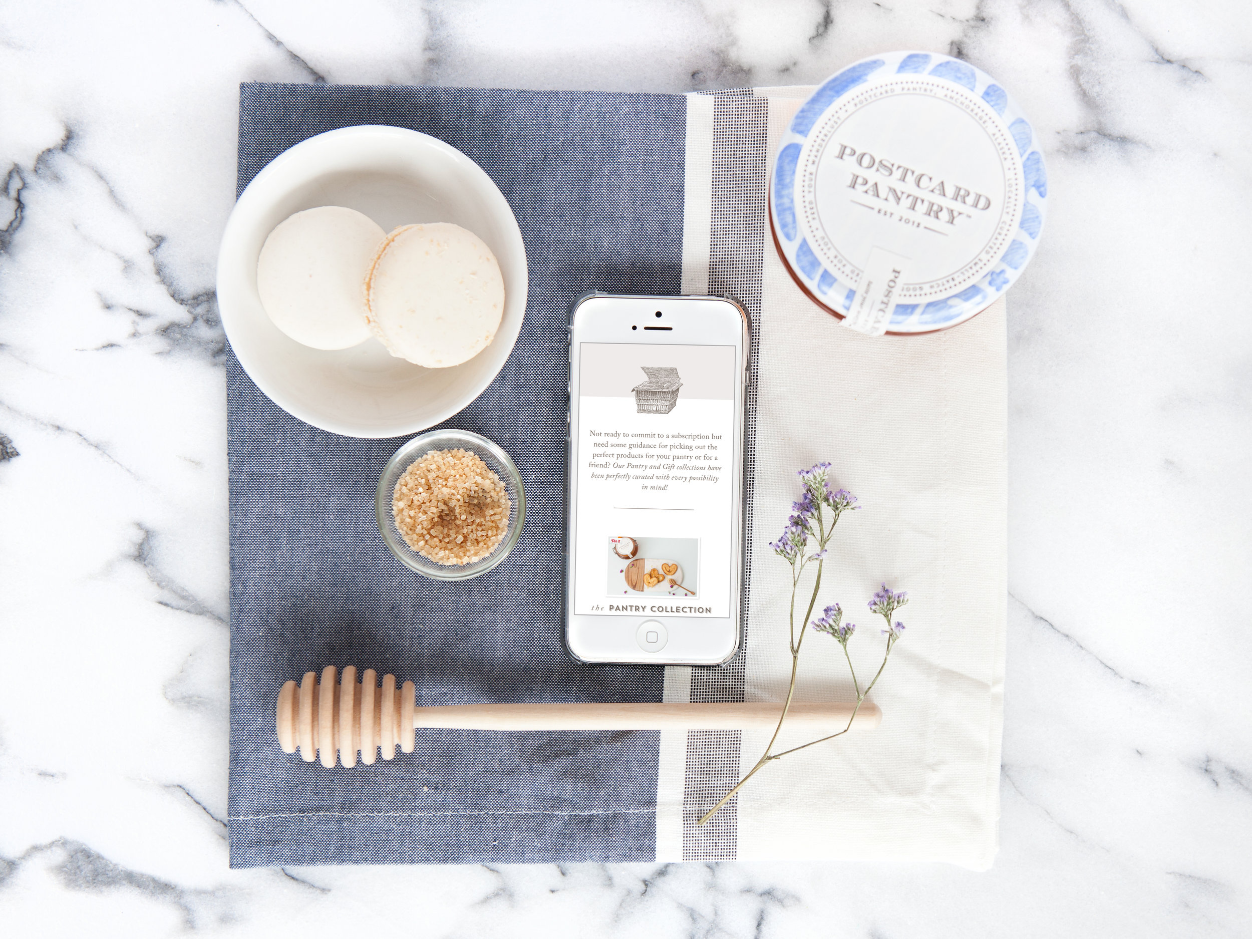
Custom designed + developed WordPress website with WooCommerce shop
Business card design
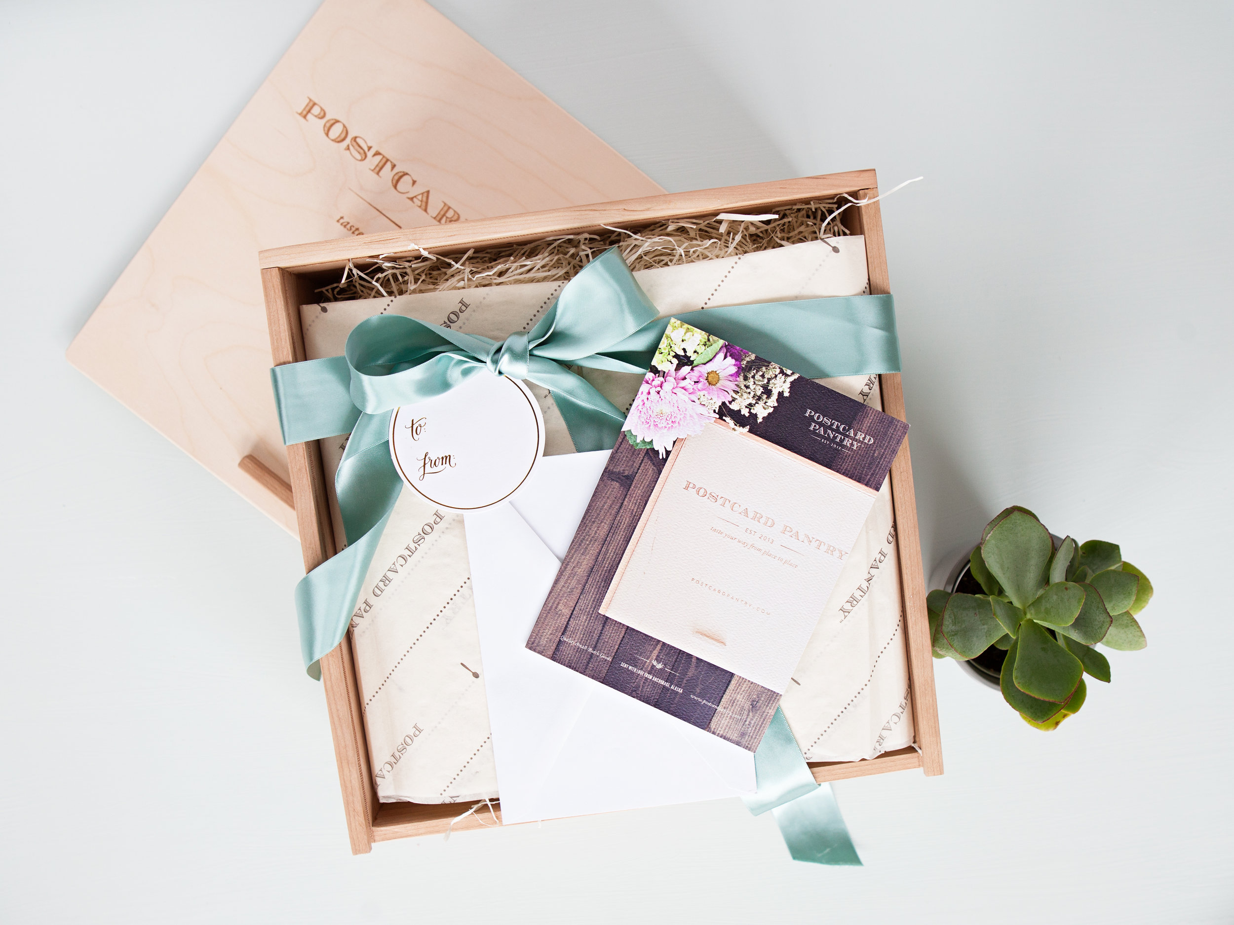
Gift box insert design
Tasting box insert design
Thank you postcard design
Media kit design
Business card design
Gift box insert design
Tasting box insert design
Thank you postcard design
Media kit design
in collaboration with
how it started
When Stephanie first approached me, I only knew the bare bones basics about the project, but hearing that it had to do with food and subscription boxes was enough to get me excited for what it could be — and what I really didn't know was just how much possibility this project truly contained. From the second we started talking at our initial consultation, I could immediately feel that this was someone who felt and cared deeply about what she was doing. And the way she was able to express this fundamental passion she had for food and community was through Postcard Pantry, a subscription and gift box service that curated the best food and artisanal products from local and American food purveyors and makers.
the challenge
We started this project off with a lot of existing but disparate brand elements, some usable and some not. The goals of the business had shifted quite a bit since the original conception of the branding, so a great deal of time was given to making sure we were thoughtful in how expanded and repurposed that original design work into something that could truly live and breathe the ideals of what Postcard Pantry is today. It meant expanding the basic foundation of that brand look and feel into a more comprehensive identity that would speak to different parts of the Postcard Pantry experience and story, which we would achieve in two tangible ways: 1. by building out a fully considered yet practical website to highlight the story and products in the online space, and 2. design actual, tangible collateral pieces that would serve to support the real life Postcard Pantry experience — items of paper and wood and ink that evoked a sense of story and place the same way the products did.
the process
Priority number one for this project was designing and developing a web presence that was catered very specifically to the needs of the new Postcard Pantry. The previous design was built for the original business model, mail-order pies, but it was extremely limited in function and lacked a robust e-commerce option. That meant something completely custom and built from the ground up, allowing her to grow her shop and product offerings while also having a place to begin slowly cultivating a community of like-minded individuals to engage via the recipes and blog sections of the site. And in order to really lift the whole experience to the level I knew it could attain, I planned to enlist some talented collaborators to address the creation of some impeccable website copy + content, and custom styled brand and product photography to use throughout the site.
Homepage style tile exploration
Product listing style tile exploration
In-progress homepage wireframes
We kicked off the process through a detailed back and forth discovery session, working to get to the true core of what Stephanie wanted to accomplish and what she was inspired by, and using her wishlist of features, functions, ideas, and inspiration to start sketching out a cohesive structure for the website, basic wireframes, and how we wanted the brand story, actual content, and visuals to guide a potential website visitor through the Postcard Pantry experience. I was so pleased to work with Ashley of Nose Graze on the development side, who took on the tough task of translating my fully custom website layouts into an actual, working Wordpress site with aplomb. Bernadette of Blueprint Society came in during this process to provide incredible, impeccable brand, lifestyle, and product imagery that took the website to the next level almost immediately. Rounding out the collaboration was Amanda and Joe of Lexicontent, a content writing and strategizing duo who were able to connect deeply with Stephanie's basic heart and mission and develop it even further into focused, poignant content that could grab attention and bring immediate credibility to Postcard Pantry's work.
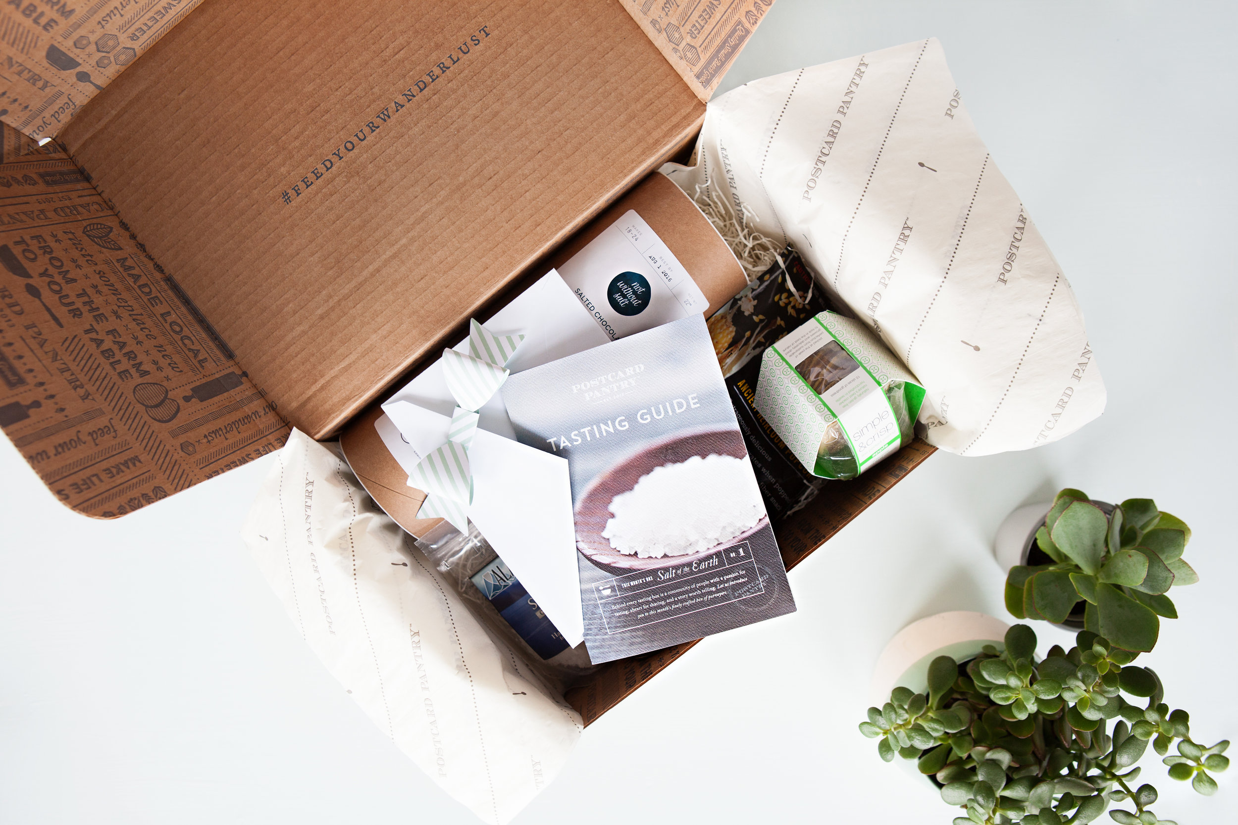
If the products themselves were the best of the best, then we needed to make sure the real-life experience of learning about and receiving these Postcard Pantry items felt consistent with the quality of the offerings, not to mention a natural extension of the website.
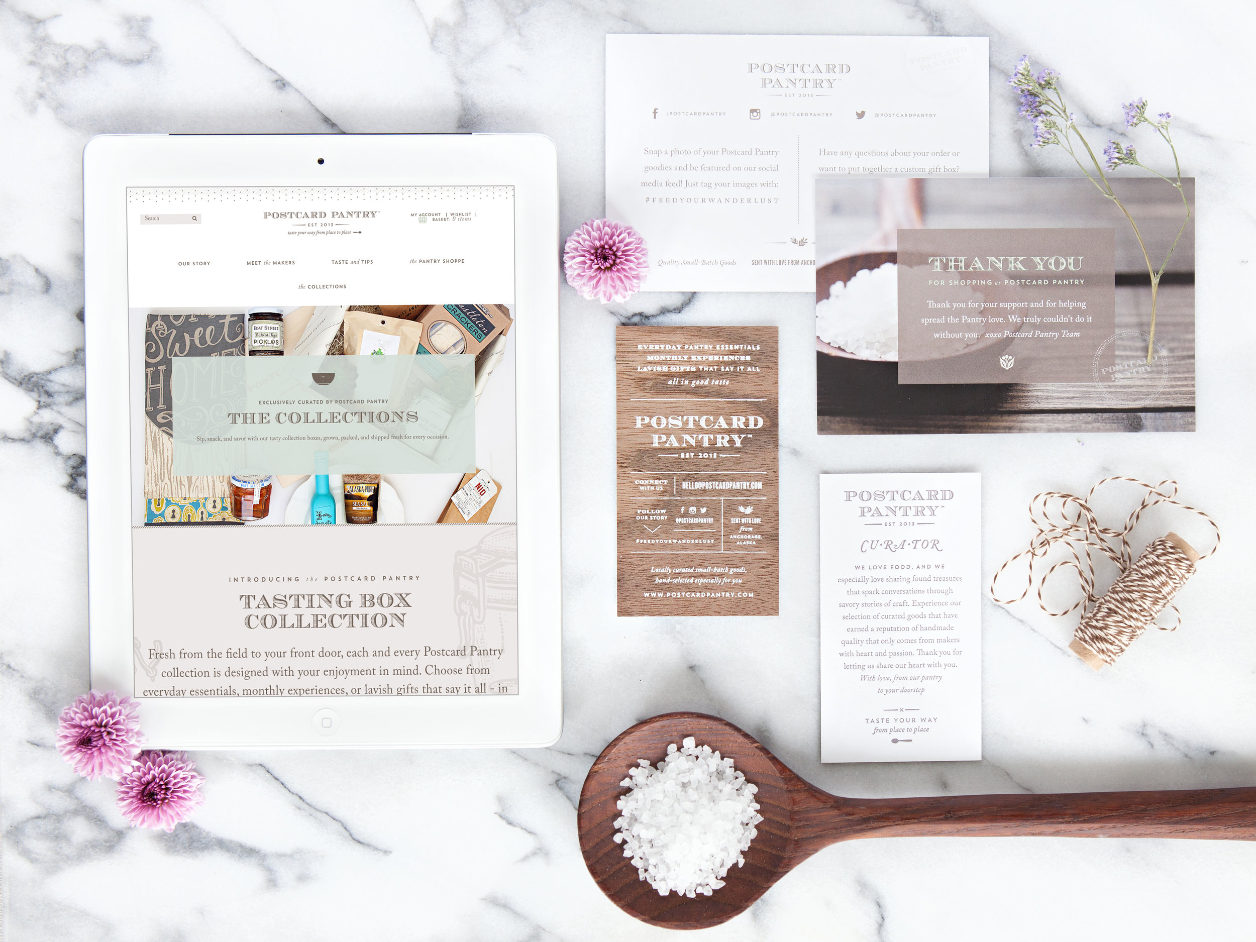
The second stage of this project focused around collateral. If the products themselves were the best of the best, then we needed to make sure the real-life experience of learning about and receiving these Postcard Pantry items felt consistent with the quality of the offerings, not to mention a natural extension of the website. Stephanie already had some beautiful packaging for her goods, including heirloom quality wooden boxes personally hand-crafted by her husband. We needed the collateral to work with her existing packaging, but also add a new dimension to the unboxing and unpacking experience. Because the priorities were aligned to ensure we brought our detail oriented approach to collateral as well, we were able to plan for beautiful and striking paper pieces that would be a real treat for customers to hold and touch.
the results
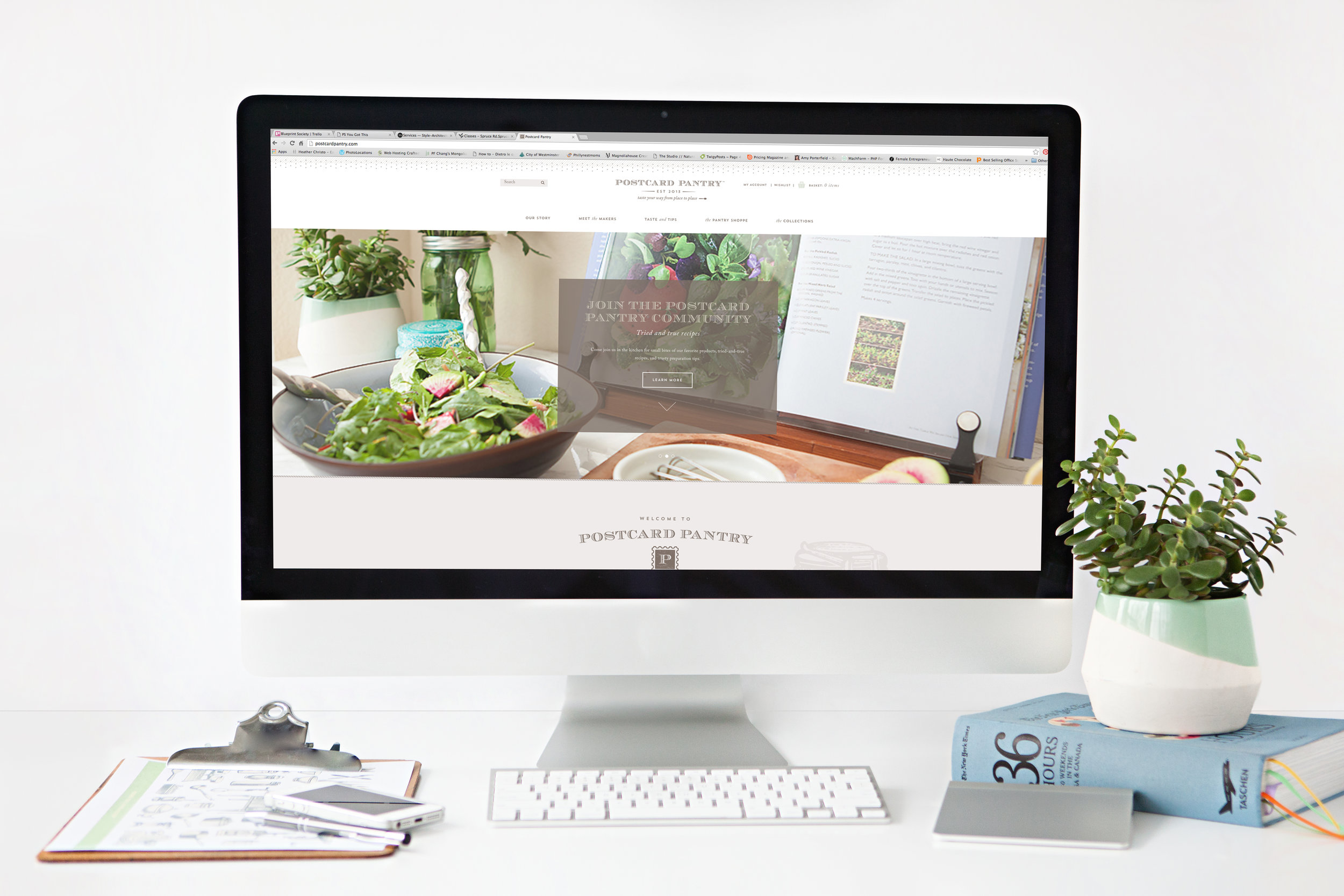
The fruit borne from this project are some of the most beautiful things I've ever had the pleasure to create. The website on its own is a delightful marvel to look at as well as use, checking off every feature on the original wish-list and then some. Even as the website responsively adjusts to smaller screen sizes, like tablets and mobile phones, the user experience is never compromised and the brand details appear as considered and specific as they were planned to be at any size. Even simple website features like hovers and content filtering were designed in a very unique and specific way, integrating seamless combinations of color, typography, and image to visually enhance the browsing experience. The website is sprinkled with small details, both existing from the previous brand work like the playful patterned edges at the top and bottom of the site and the repurposing of simple icon flourishes into specific markers that match up with different types of content on the site, and new, like the engraved, old-fashioned food related illustrations to add more visual interest to larger expanses of background space when one scrolls through the site.
This site was packed full of custom features - one example is the unique navigation hover that showed a sneak peek at what the page was about before the visitor needs to click further.
To properly take advantage of the engaging imagery featured on the site and to give it its own unique flair, we created a custom ongoing display grid that highlighted products, makers, blog posts and recipes. A filter feature allows the user to immediately view by certain categories.

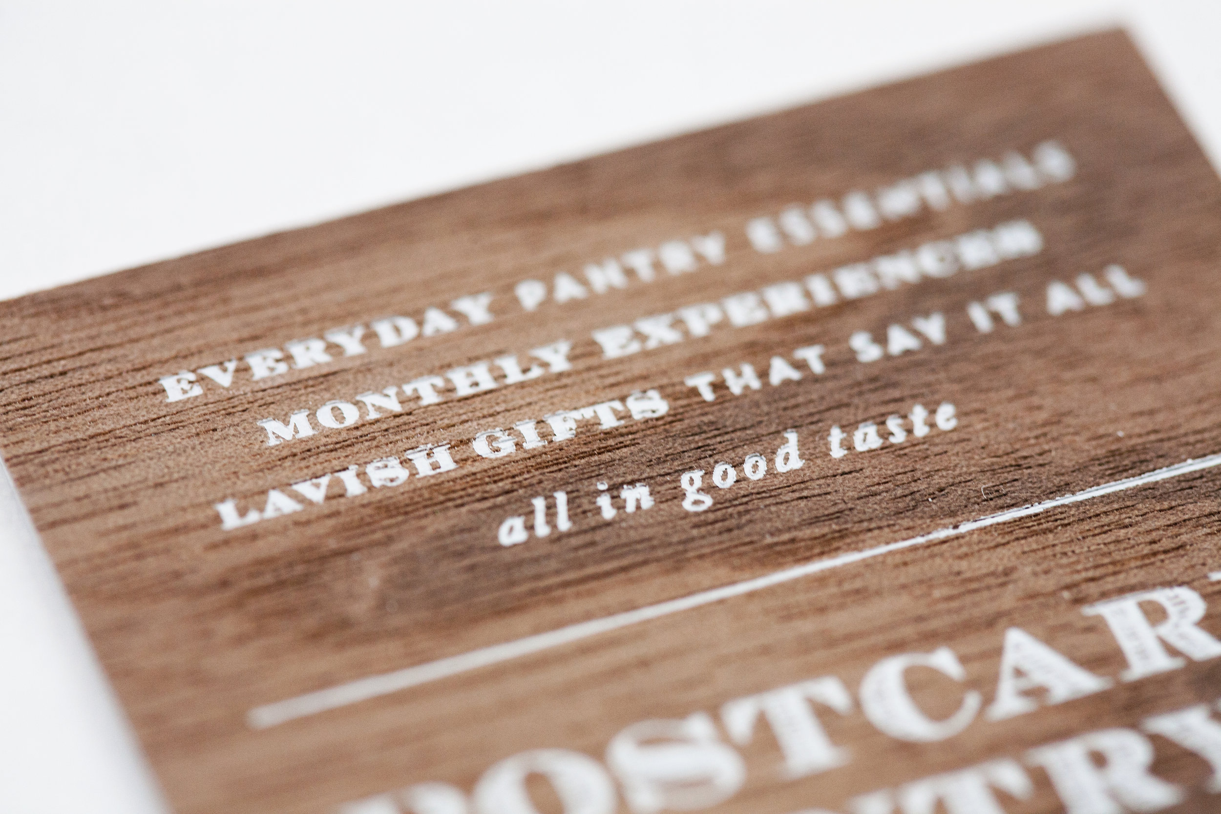
On the print design side, we were able to fully embrace the Postcard Pantry ethos of handcrafted and meticulously made and translate that to beautiful full color inserts and brochures, printed on textured, cotton papers. With the business cards, we were able to go a step beyond and bring in incredible natural, tactile elements, utilizing real walnut wood with white printed text on one side and pulpy cotton stock with warm grey letterpress printing on the other. They leave an undeniably memorable impression on anyone who is lucky enough to grab one of these beauties and reinforces the care and attention to detail that make Postcard Pantry the kind of business it is.
in stephanie's own words
What would you define as the catalyst or motivation for taking the leap and hiring a new designer?
The previous website was non-functional with broken code. The aesthetics and brand message needed a clean fresh start. The business model had changed to subscription-based instead of a physical brick & mortar. The catalyst was watching YouTube videos for 5 hours trying to fix my website realizing this is not going to end well like so many of my DIY projects around the house.
So there I was with a non-functional website (Postcard Pies), a desire to change business directions (in a big way), frustrated that I couldn't get from point A to B, and even bigger questions of why I was continuing to pursue these big goals when the odds were clearly not in my favor (aka broke). I had two choices: a) try to recover my losses and walk away or b) give this burning passion of mine one more last big push.
Phyllis came by way of recommendation by two professionals, IdeaLust, whom had first hand experience and were relentless that I connect with her to just get a quote and a solid (honest) professional opinion. From our first over the phone meeting it was clear that Phyllis had the gift to take these big ideas and make sense of it, all of it, and she said YES! That yes literally meant: yes your dream is achievable, yes this is a difficult project that will take some time, yes I'm invested in PP because I believe in PP, yes this will be difficult, and yes the rewards will be there tucked away in between all the layers of hard work built into the brand of PP.
How did you decide on a designer?
There were three contenders, after receiving a discovery packet from Phyllis I knew right away she understood...it was more than a website. She had packets of homework that would provide a step by step guide of who PP is and what we do which is no small task. She wanted to truly understand the business to do her best work and didn't stop at the front door, we went through it all in an organized process that was direct and enlightening for both of us. The high level of commitment and professionalism was the ultimate reason for moving forward with Phyllis.
What are your overall impressions of the design experience?
It was a lot of hard work, with something of this magnitude there is no way you can say that was easy and have something come out the other end that you are so proud of accomplishing. This was a labor of love that took less than six months to execute (astonishing), to plan, architect, design, develop, test, and launch. There was never a moment that I didn't feel confident or question the direction we were going.
The most surprising thing to me was the road map outlining the scope of the project, milestones, dates, and our measured success throughout the life of the project as well as tracking side projects that tied in at various points. I always knew at what stage of progress we were in and never once had to inquire what was being worked on and when can I expect that work to be completed. The transparency throughout was impressive and something I have modeled after within my own business.
What specific results and improvements have you seen in your business?
By completing all the steps from concept to launch has helped us truly understand what we're best at and how to best serve our customers. That is significant for Postcard Pantry. I've been seeing steady growth with our online presence through increased web traffic + sales, and our social media footprint is steadily growing in numbers. Using a cohesive approach to from all online platforms to printed collateral has strengthened our brand message significantly.